
How to Build a Standout photography Brand
How to Build a Standout Photography Brand (That people actually want to invest in)
The seasons are shifting, and I think we're heading into a really interesting time for photography brands.
Because truthfully, it has never been easier to make a photography business look good. There is beautiful inspiration everywhere; you can buy an entire semi-custom brand from an Etsy witch, find a lovely font in approximately twelve seconds, ask AI to write your homepage (let’s not), download somebody else's preset and have Pinterest serve you seventeen thousand pieces of beautifully curated inspiration.
We have more tools, more education and more access to genuinely good resources than we've ever had before and, generally speaking, I think that's a wonderful thing. I don't particularly miss the days of every photographer having a curly handwritten logo floating over a full-screen pixelated photograph with some watercolour flower hanging precariously in the top left corner.
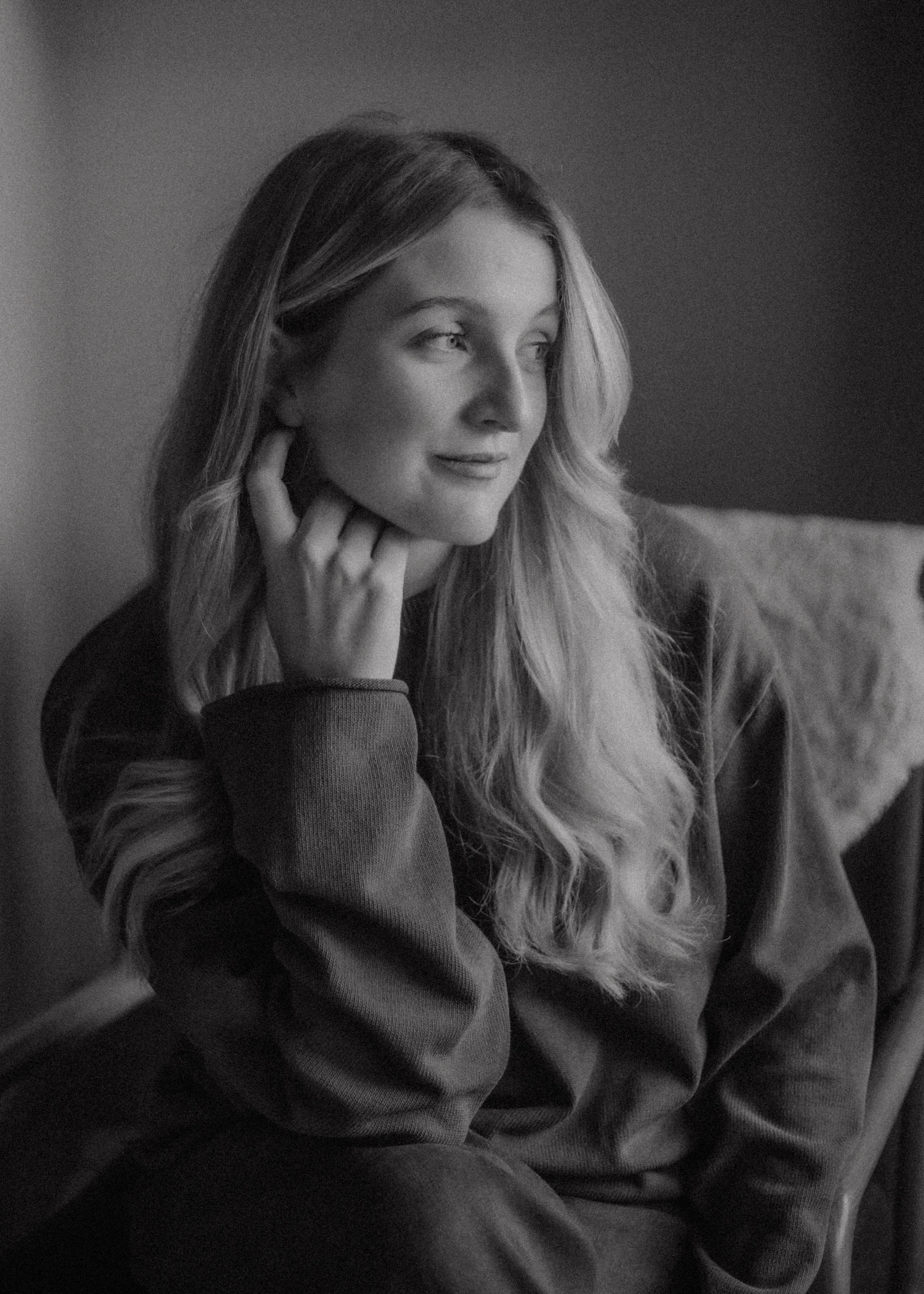
But all of that accessibility creates a slightly strange problem. When everybody can look good, looking good stops being the thing that makes you interesting. Your potential client isn't choosing between one incredible photographer with a gorgeous website and nine people whose websites haven't been touched since 2009 anymore. They're much more likely to have ten tabs open containing ten genuinely talented photographers, all with beautiful portfolios, lovely websites, professional branding and, quite often, very similar ways of talking about what they do. Everybody is capturing the authentic moments, telling your story and preserving the perfectly imperfect, and eventually all of that lovely starts becoming a little difficult to distinguish from the next lovely thing. You’re getting lost.
And this is why, looking towards 2027, I think the photographers who stand out are going to be the ones who stop thinking quite so much about how to make their business look better and start thinking about how to make it feel more recognisable. Not necessarily louder or stranger or more fashionable, but more specific to them. The photography, visual identity, website, words, portfolio and whole creative world surrounding the business should start feeling connected enough that somebody remembers it afterwards, even if they can't quite explain why.
As an art director, that is the bit I'm fascinated by, because your photography is obviously at the heart of your brand, but your photography isn't the whole brand. The brand is the world we build around it.
“Your photography should be where the brand begins, then the rest comes.”
Photographers have a slightly unusual relationship with branding because your work is already so incredibly visual. If you're a copywriter or an accountant or somebody selling something that doesn't naturally come with hundreds of beautiful images, creating a visual identity is a much more obvious exercise in deciding what the business should look like. Photographers already have this enormous visual language sitting right in front of them, and yet strangely, when it comes to branding, they often ignore it. (Yes, I’m talking about you.)
Togs spend years developing their photographic style. We learn what kind of light makes us want to reach for the camera, whether we're drawn towards huge sweeping portraits or the tiny moments happening at the edge of the room, how we like skin to feel, how much grain is too much grain, whether we want things to feel polished or messy or nostalgic or quiet, moody or bright. Then when it comes to branding the business around all of that carefully developed instinct, we open Pinterest, save six photographer logos we like, choose a serif, pick three colours and start trying to work out what is currently considered ‘right’.
And I think we're starting at completely the wrong end.
When I'm looking at a photography brand, I want to start with the photographs. Not necessarily the photographs that performed best on ‘socialmeeds’ or the ones you think are technically the most impressive, but the ones you are inexplicably obsessed with. I want to see the image you still think about from a wedding three years ago, the photograph you took on your phone because the light was doing something lovely across your kitchen table, the slightly blurry frame the client didn't choose but you can't bring yourself to delete. I want to understand what keeps appearing in your work when nobody has deliberately put it there, because those little repetitions often tell us far more about your visual identity than a slapped-together ‘I kinda like this’ ever can.
Maybe there is an enormous amount of negative space in your photographs. Maybe hands appear constantly. Maybe you're always photographing people incredibly close, or perhaps they're tiny little figures swallowed by landscapes. Maybe your favourite work is full of movement and noise and slightly chaotic joy, or perhaps everything you love has this beautiful stillness running through it. Those things start giving us clues about what the world around your photography could feel like.
That's where I think art direction becomes so valuable, because instead of designing a lovely brand and then finding somewhere inside it to place your photographs, we can allow the brand to grow out of the work itself. Typography, colour, layout, graphic details and even the way we use space can all respond to something that already exists within your photography. Your images stop being content we're dropping into a website and become the starting point for the entire visual language. That doesn't mean that if your photography is nostalgic, I am immediately going to make everything brown, put a fake film border around it and find you a typewriter font. There is a difference between interpreting a feeling and creating a weird, cheesy themed situation.
It’s about feeling like your brand is something smart.
This is where art direction changes everything
Art direction is just the process of deciding how something should feel and then making intentional visual choices that help create that feeling.
Photographers are already doing this constantly. Every time you decide what belongs inside your frame, where somebody stands, whether you move closer, whether you use the obvious beautiful light or the slightly strange patch of it in the corner, you are making decisions about how somebody will experience what you're creating. You do it again when you're editing, and again when you're choosing which photographs make the final gallery. Art direction simply takes that same visual thinking and lets it wander out into the rest of the business.
Suddenly we're asking which photograph somebody should see first when they land on your website and why. We're thinking about whether your imagery needs acres of breathing room or whether it feels more alive layered together almost like prints scattered across a table. We're asking whether your typography should quietly disappear behind the photographs or become part of the composition itself. We're thinking about how the words sound beside the imagery, what your portfolio says about the work you want to be shooting next and whether the whole thing actually feels like the same photographer.
“This is where a photography brand starts becoming much more than a logo and a colour palette. It becomes a little creative world, and every decision is either strengthening that world or quietly pulling us away from it.”
The lovely thing is that the ingredients for that world usually already exist. You've probably been collecting them for years without realising. They're in your photography, obviously, but they're also in the films you've watched seventeen times, the books piled beside your bed, the postcards you've kept for no particular reason, the interiors you save on Pinterest, the places you always want to return to and the strange little things you photograph when nobody is paying you. I always find it much more interesting when photographers start looking outside photography for their creative references, because if your entire inspiration folder consists of other photographers in your niche, there is only so far we can go before everything starts folding back in on itself.
That doesn't mean inspiration is bad. Creativity has always been referential, and none of us are creating in a vacuum. But there is a point where consuming everybody else's work becomes so noisy that you stop being able to hear your own instincts underneath it, and I think that's something a lot of photographers are struggling with without necessarily realising it. Sometimes the answer isn't another moodboard or another saved Instagram post. Sometimes you need to stop looking sideways for a little while and work out what you've actually been drawn towards all along.
Your website isn't where you display the brand. It's part of it.
This is probably the thing I have become most opinionated about after years of designing photographer websites. I don't think your website should simply be somewhere we put your finished visual identity and upload your portfolio. The website itself is part of the art direction, because the way somebody experiences a photograph changes depending on how we show it to them.
The same photograph can feel completely different when it's enormous and sitting alone in a sea of empty space compared with when it's cropped tightly and layered amongst six other images. Put it beside a tiny elegant serif and perhaps it suddenly feels quiet and editorial. Pair it with huge expressive typography and unexpected movement and it becomes something else entirely. The photograph hasn't changed, but its context has, and context is an enormous part of how we experience visual work.
That's why I think photographer websites become infinitely more interesting when we stop designing them like containers. We can think about rhythm in exactly the same way we might think about sequencing a book or art directing an editorial. Maybe somebody lands inside one enormous photograph and we let them stay there for a moment before asking them to read anything. Maybe three tiny images appear together because something about their colour or movement makes them beautiful beside one another, even though they were photographed months apart. Maybe there is a sentence that deserves as much space as an image. Maybe the homepage isn't simply an introduction to the rest of the website but a little condensed journey through the entire world of the brand.
Obviously, somewhere inside my head while I'm getting excited about all of this, there is also the website designer reminding everyone that an actual human being needs to be able to use the bloody thing. Somebody still needs to know what you photograph, where you're based, how to enquire and preferably shouldn't need to embark on a small archaeological expedition through your navigation to find your pricing. It needs to work beautifully on mobile, it needs to load properly, it needs to make sense structurally and, yes, Google needs to understand what we're talking about too. But beautiful and useful have never been opposites. Good art direction doesn't make a website more confusing. It gives all of that useful information a visual language that feels like it could only belong to you.
The brands that stand out in 2027 will feel more human, not more perfect
I think this is probably where all of these thoughts eventually meet, because the creative landscape we're moving into is changing incredibly quickly. AI can already help us write copy, generate imagery, build websites, create ideas, make moodboards and do an ever-growing list of things that once required quite a lot of technical knowledge. A photographer starting a business in 2027 will be able to create something polished incredibly quickly, and I'm not inherently horrified by that. Tools change. Industries change. We adapt.
When everybody has access to tools that can make something look professional, knowing what should actually be made becomes the interesting bit. Knowing when something is technically perfect but completely devoid of personality becomes important. Knowing that the slightly strange photograph is more interesting than the obvious beautiful one, or that the brand needs a colour nobody else in your niche is currently using, or that a sentence sounds more like you before somebody polished all of the life out of it, becomes valuable.
The things that are hardest to automate are often the things that make creative work memorable in the first place. Your experiences, your references, your humour, the places you've lived, the books you've read, the things you think are beautiful that somebody else might walk straight past. All of that gets folded into your creative judgement, and your creative judgement is what creates a point of view.
This is why I don't think the answer for photographers heading into 2027 is to become more polished. If anything, I think we've reached peak polished. The interesting question now is whether somebody can recognise you amongst all of it.
And recognition isn't the same as the version of consistency we've been sold for years, where every Instagram post uses precisely the same three colours and you're terrified to introduce a font that isn't listed on page fourteen of your brand guidelines. The brands we recognise instinctively aren't necessarily repeating themselves all the time. They just have a sensibility running through everything. There might be a particular relationship with colour, a way imagery is cropped, a certain pace, a sense of humour, a softness or a weirdness or a restraint that keeps appearing even when the individual pieces change.
That's what I want photographers to chase. Not how do I make my photography business look more professional? But how do I make this whole thing feel more like me?
